This project was developed as a ‘Hypothetical’ one-day Designers conference. Aimed at design students, educators, and practitioners, the conference features a trans-media narrative built around
three touch-points: Engage, Inform, and Experience.
Heres my take on the brief↓
three touch-points: Engage, Inform, and Experience.
Heres my take on the brief↓
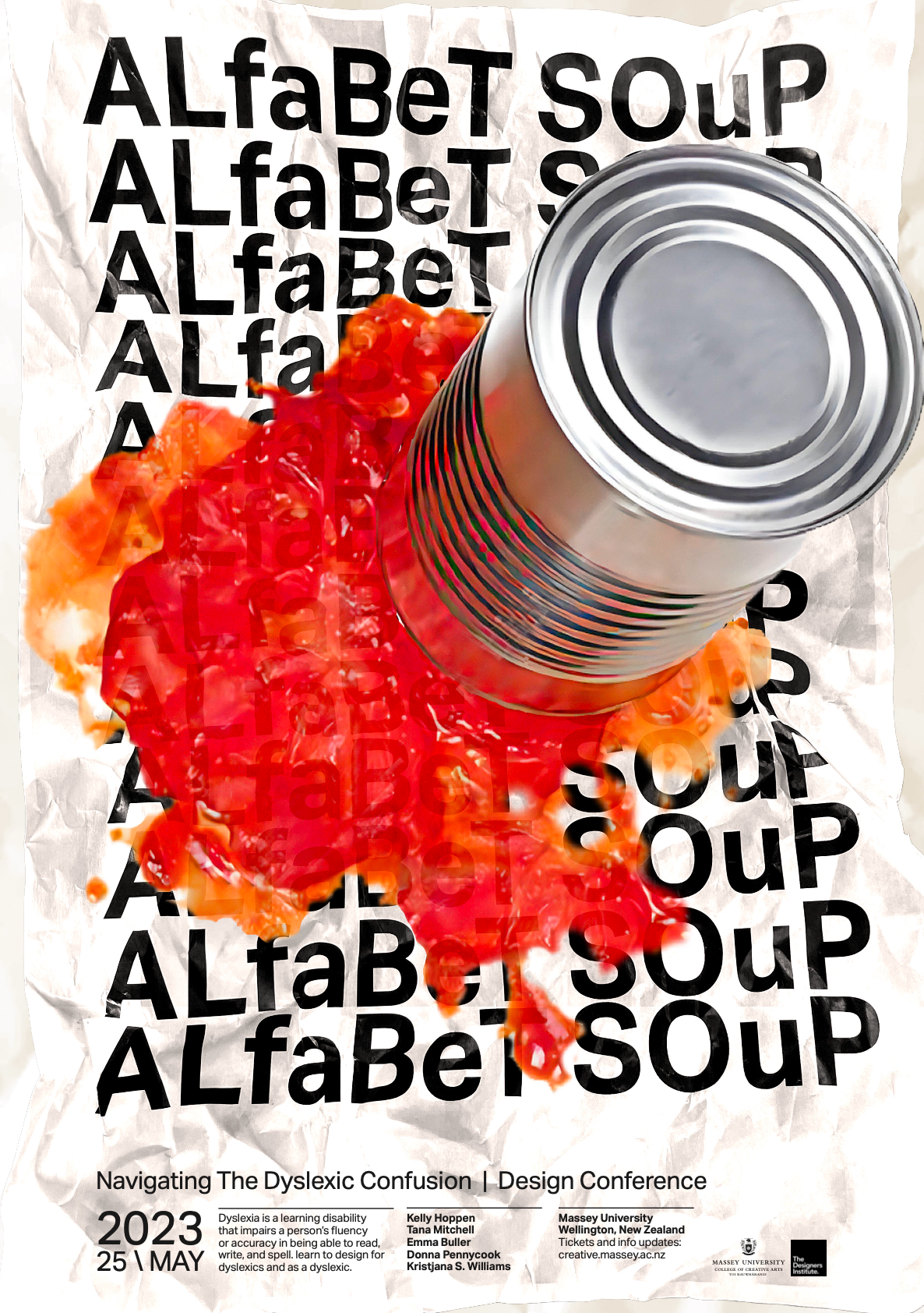
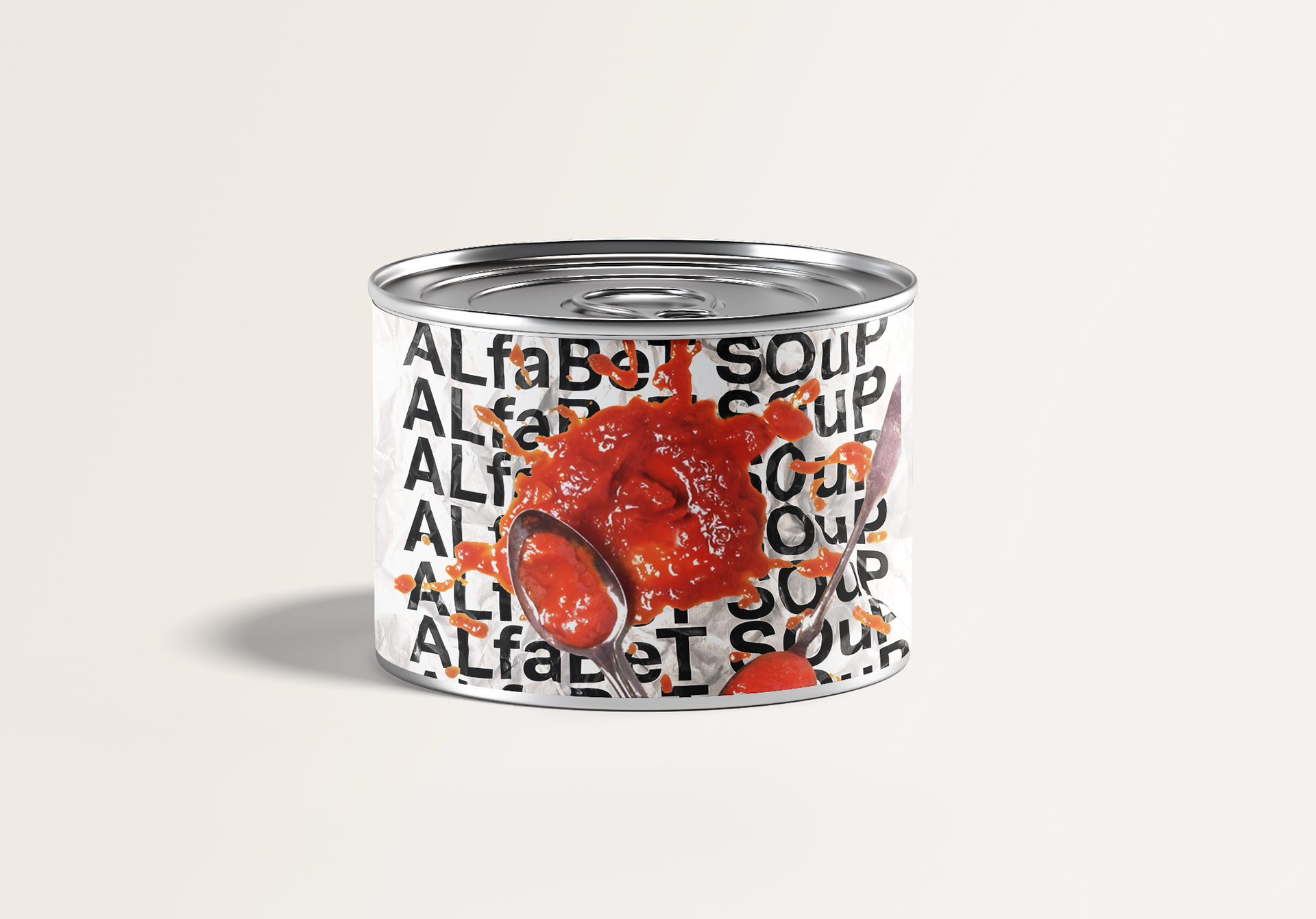
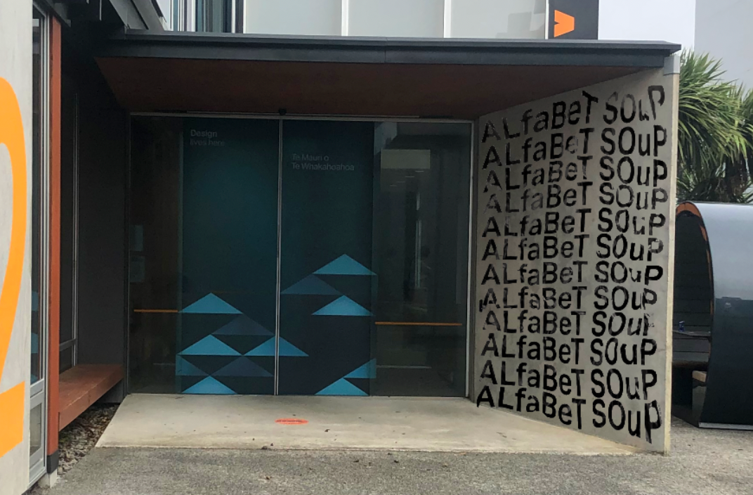
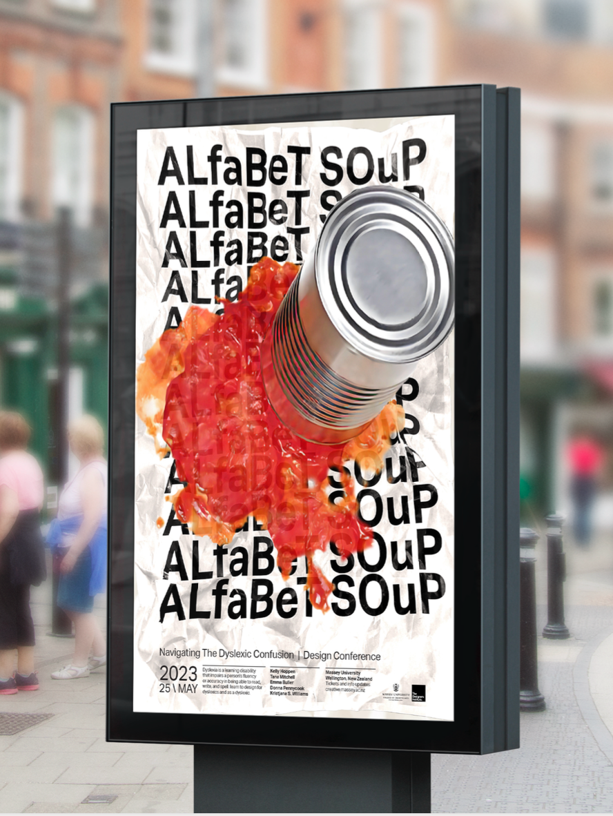
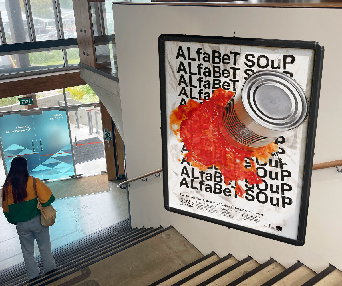
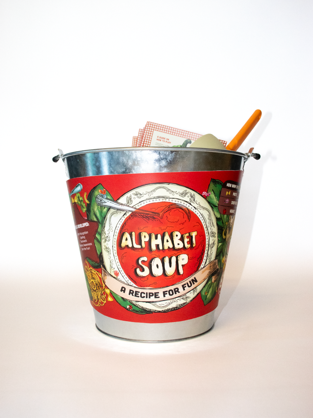
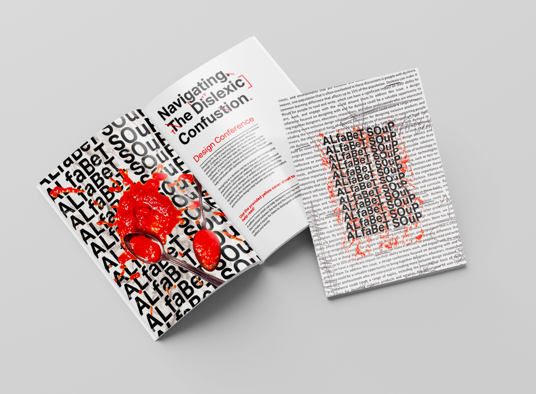
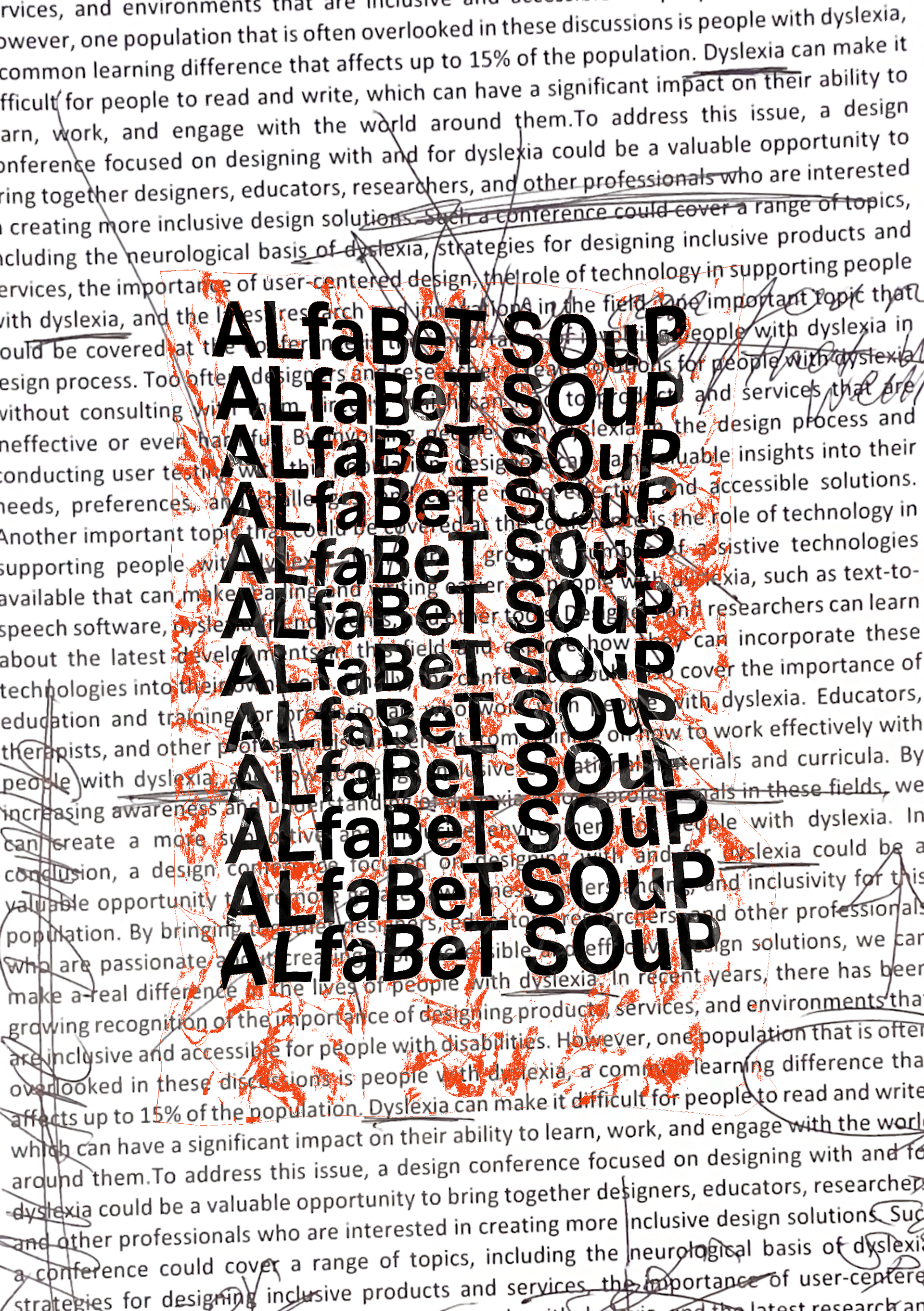
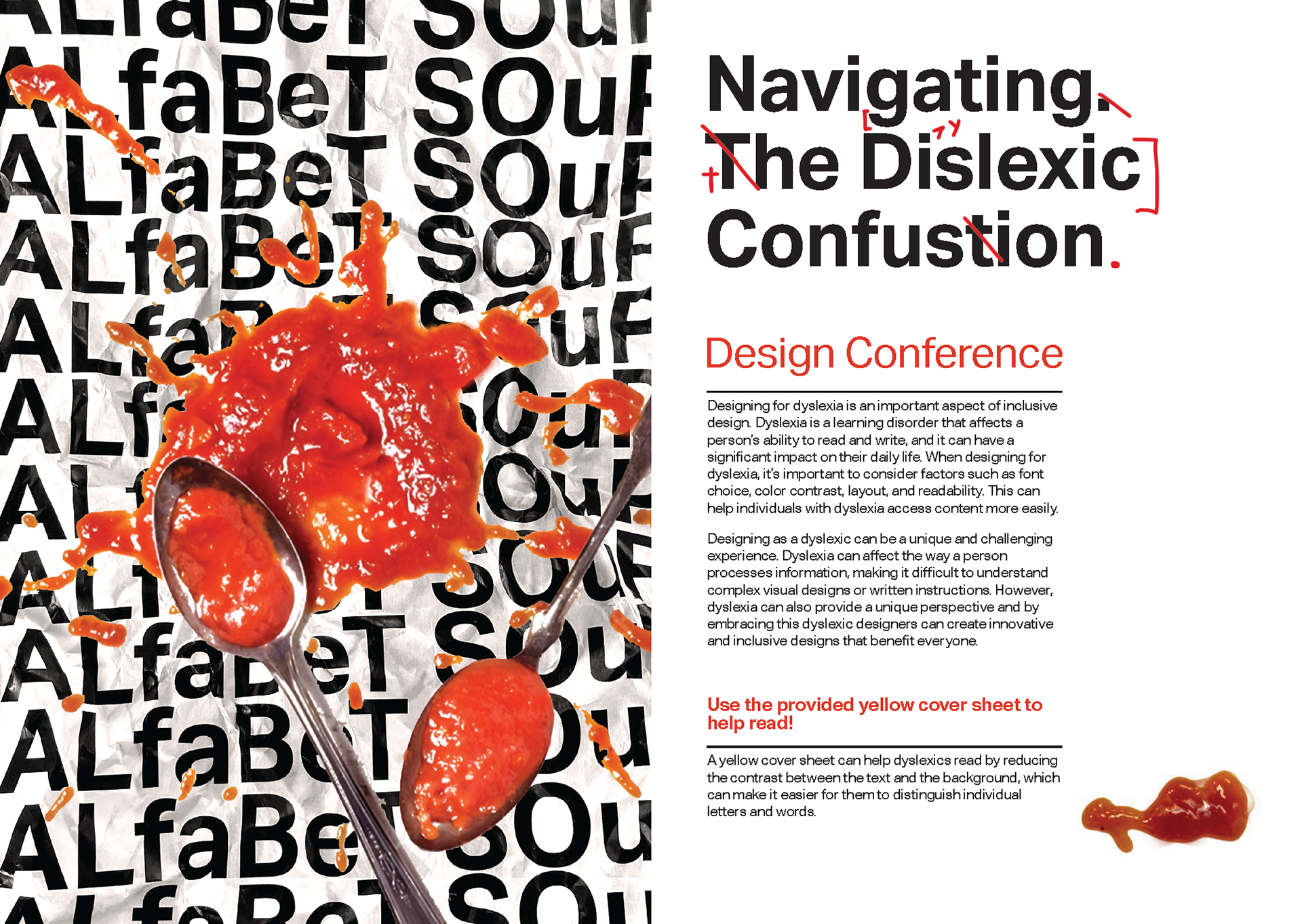
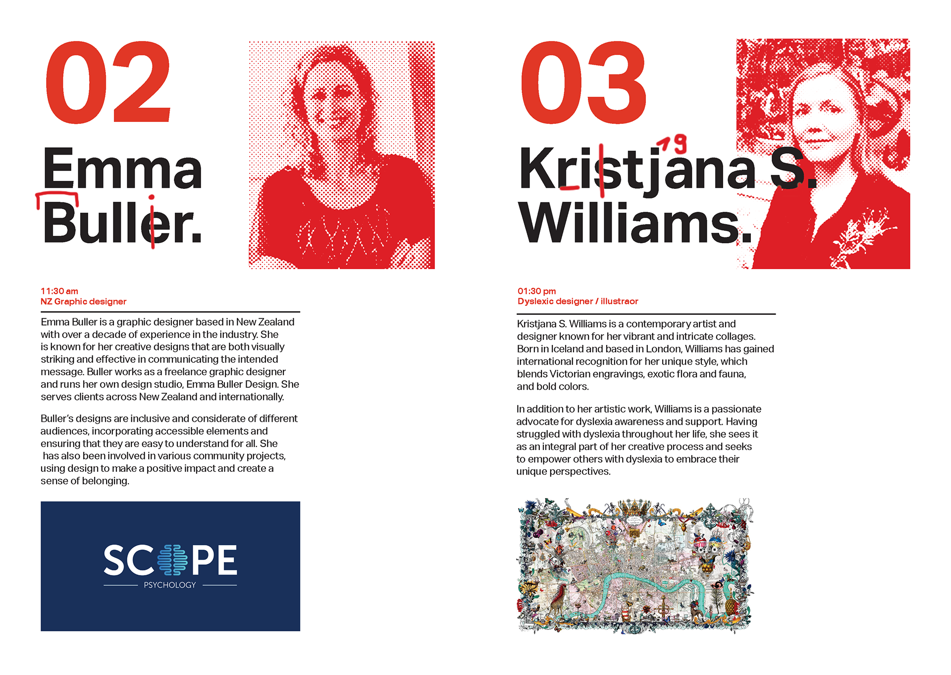
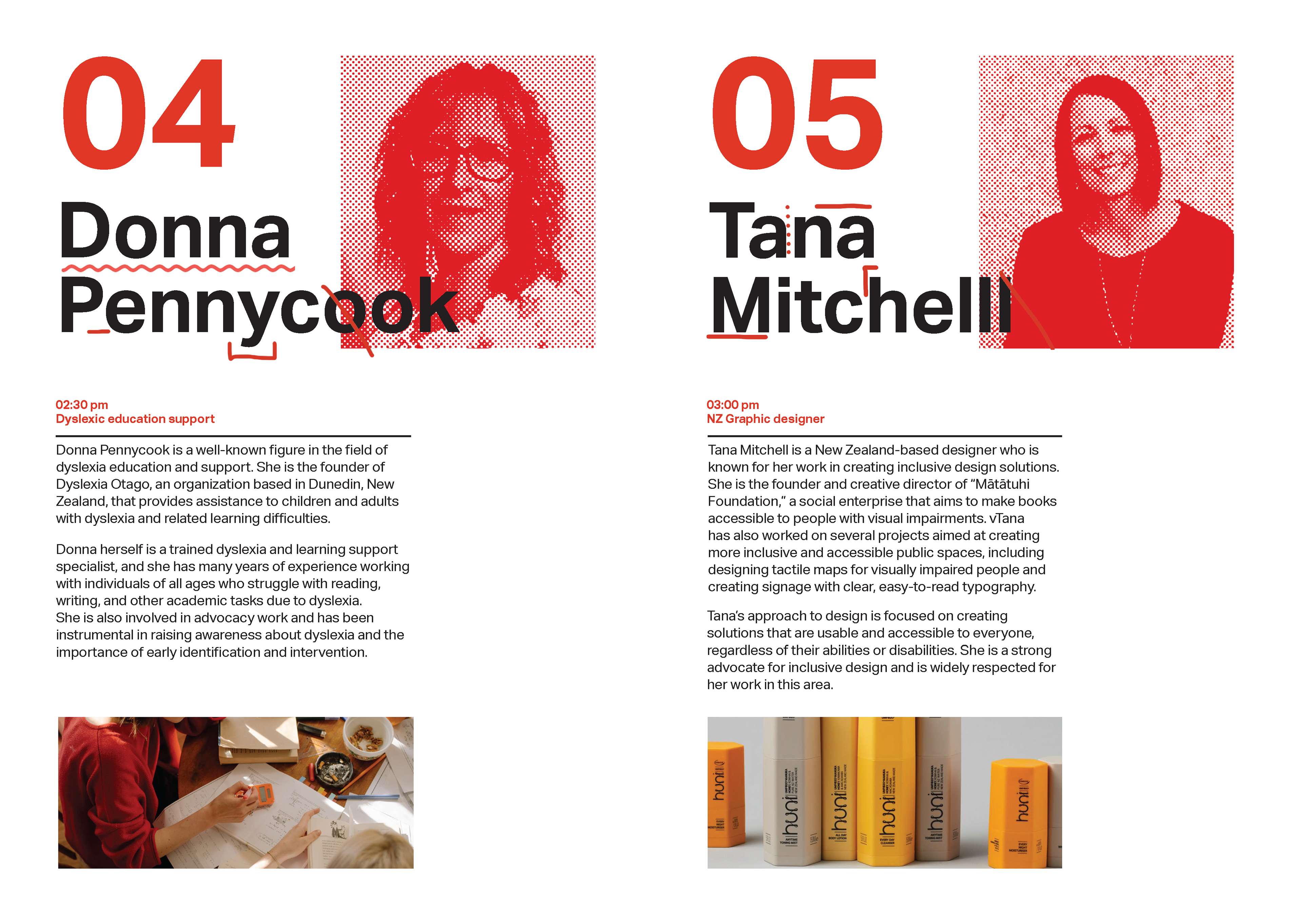
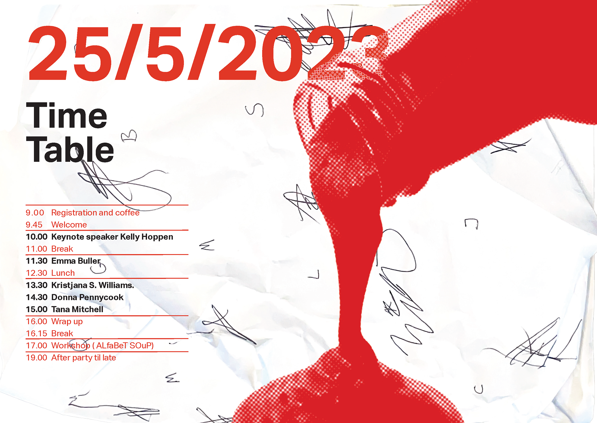
'ALfaBeT SOuP' is a conference concept designed to raise awareness about dyslexia, its impact on design, and the importance of creating inclusive solutions. Drawing from my personal experiences with dyslexia, I focused on communicating the chaos and frustration often felt while navigating reading and spelling. This is reflected in the use of bold, vibrant colors like red, large and clear typography, and deliberate visual disarray inspired by my school days of marked-up mistakes.
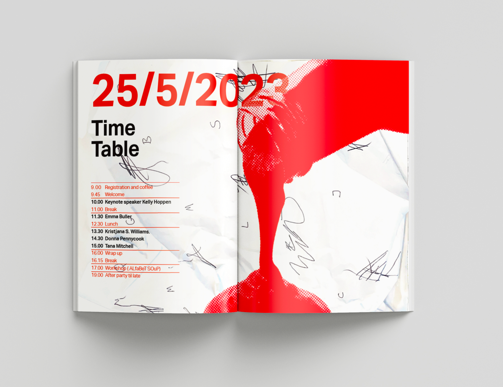
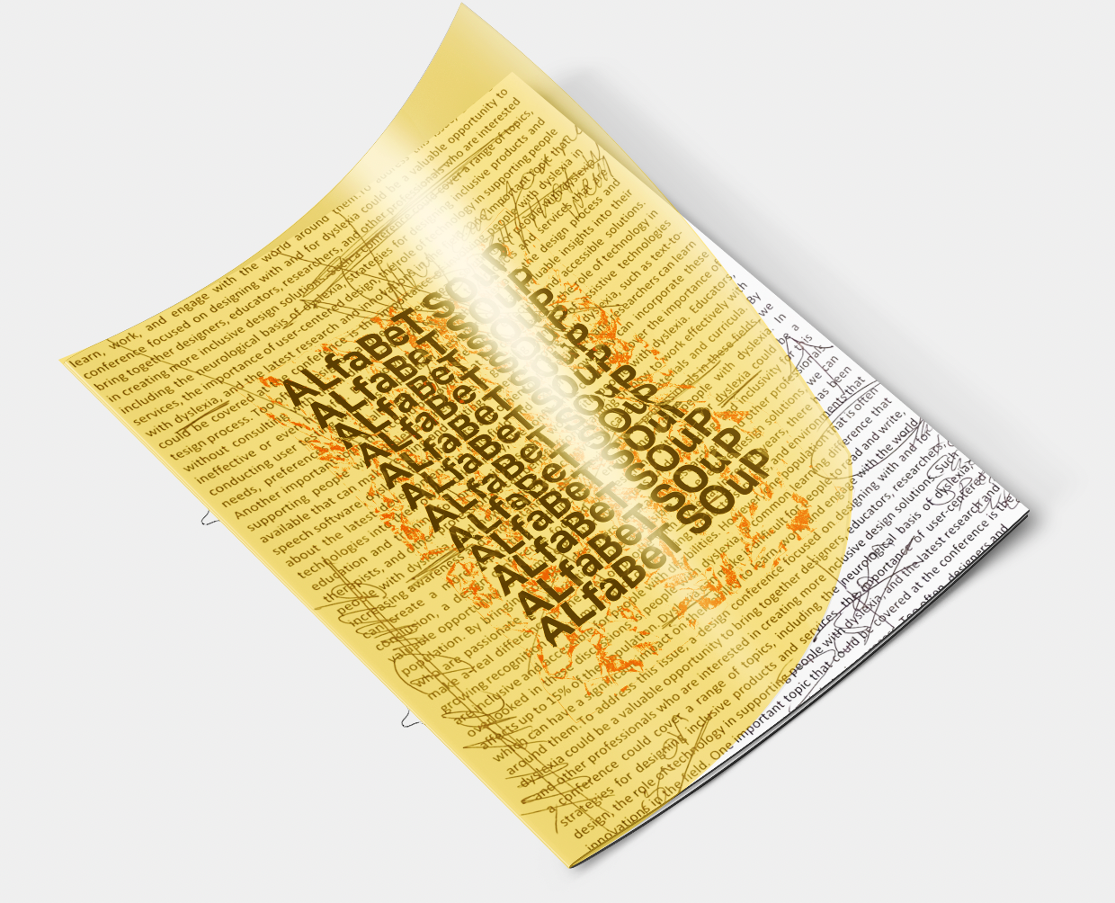
The touchpoints blend accessible design with the raw reality of dyslexic challenges. For example, the detachable yellow cover screen on the conference brochure helps make reading easier for dyslexic individuals while demonstrating a simple, inclusive practice for designers.
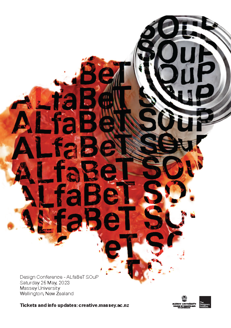
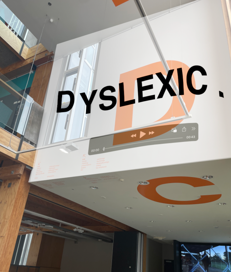
To experience this concept, I created a short animation that blends typographic chaos with realistic soup imagery. This unexpected and jarring combination reflects the mental scramble often experienced by dyslexic individuals, offering viewers a glimpse into this unique perspective.
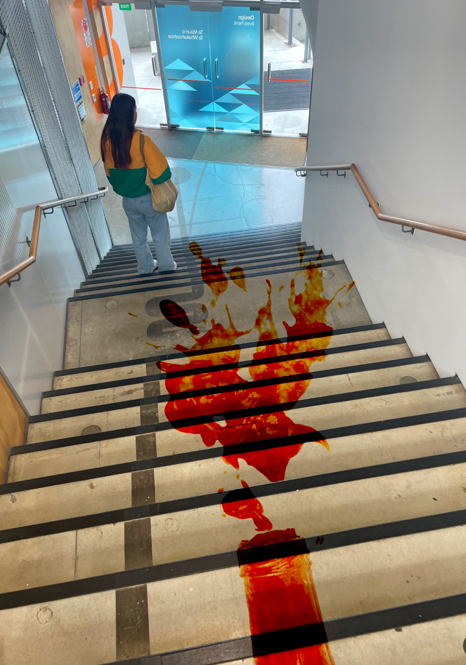
Additionally, I designed a can of red paint—symbolising "soup"—to encourage hands-on interaction.
This tactile element invites participants to embrace the messiness, showing the
chaotic and creative nature of a dyslexic mind.
This tactile element invites participants to embrace the messiness, showing the
chaotic and creative nature of a dyslexic mind.